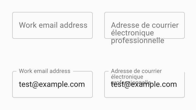
So much front-end work these days is spent making forms less useable. The weirdly animated label of the Material Design text-input fields perhaps the exemplar of taking something people understand and making it less understandable for the sake of shiny effects.
(Via @fiinixdesign on Twitter)
